Cardiometabolic Health (Telemedicine)
Promoting good cardiometabolic health through tailored recommendations
Challenge
Pivot the product vision to a direction more valuable for users and the business overall, using a strong design perspective and diplomatic leadership skills. Deliver on those designs and work closely with engineering to bring them to life.
- My Role: Lead Designer
- My Team: Product Management, Content Strategy, Clinical, Behavioral Science, & Engineering
- Client: In-House Role
- Business Goal: Deliver a cardiometabolic feature in 2025 to expand portfolio of solutions
- Duration: 6 months and continuing into 2025
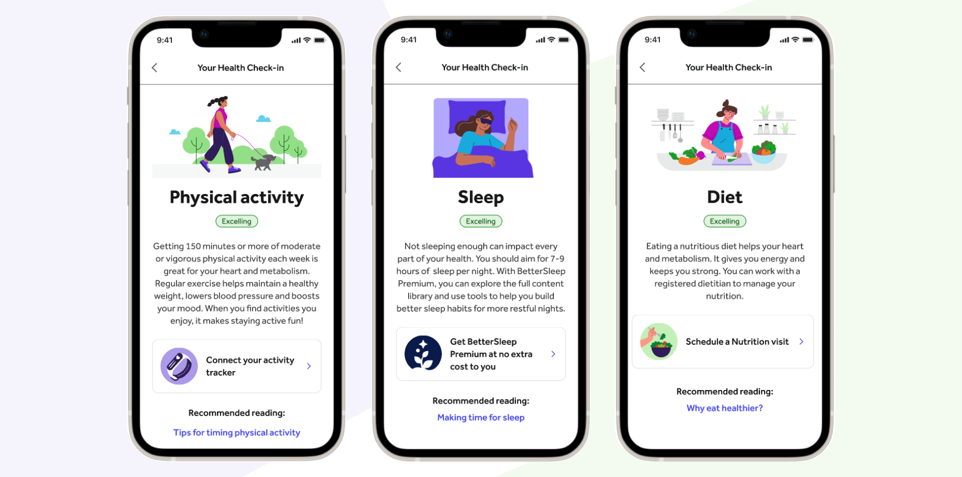
Sample of final mobile designs
Discovery
What is cardiometabolic health?
- Cardiometabolic health is measured by the American Heart Association using "Life's essential 8": sleep, diet, physical activity, smoking, blood pressure, blood sugar, cholesterol, weight, stress. The health quality of each of those pillars defines a person's overall cardiometabolic health. They are interconnected, meaning improving in one pillar can lead to improvements in others.
- Our users are managing diabetes, hypertension, and/or obesity, and are therefore likely have poor cardiometabolic health. By providing high value features to promote ways to improve cardiometabolic health, we increase the odds that our users will have positive health outcomes while using our products.
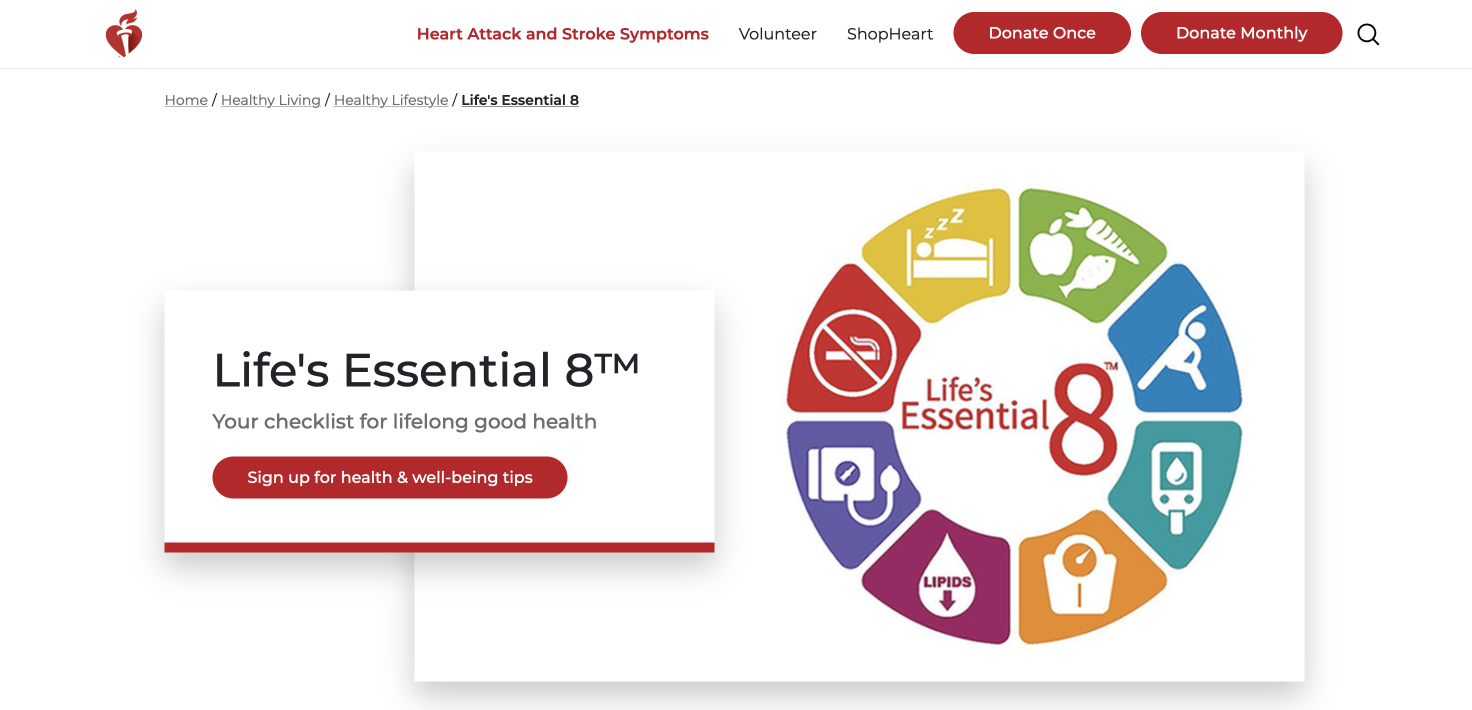
Source: American Heart Association
Influencing strategic direction
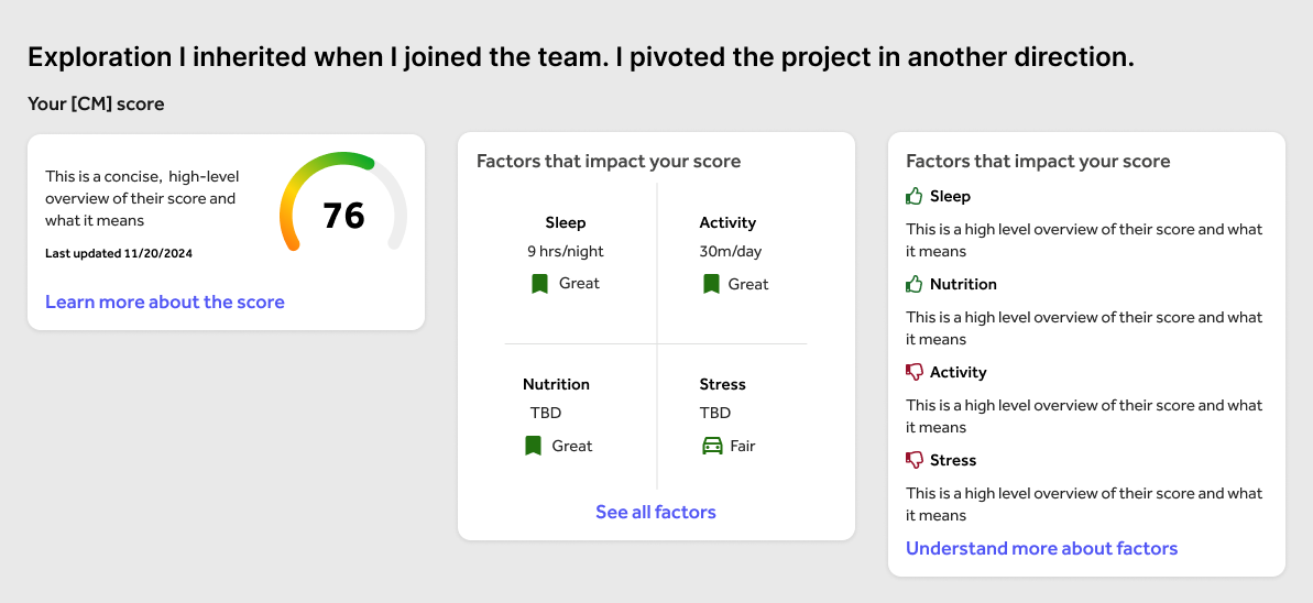
I joined the project mid-way through discovery. The team did not have a strong design presence yet and product management was deferring to the sales and clinical team to set a product direction. They wanted to measure user data against the AHA's 8 life essentials and give users a numerical cardiometabolic "score", similar to a credit score, and then display that score on the user's dashboard. I was skeptical of this approach for many reasons:
- Simply putting a numeric value on a person's health, especially when they are managing one or more chronic health condition, could feel judgemental and alienate users instead of encouraging them.
- How valuable users would find a score remained unclear since the vision was just a score and lacked any clear-cut recommendations on what users should do to improve.
- The score would be proprietary and would require heavy involvement from our regulatory team. The proprietary nature of the score could also be confusing to clients and end users alike. These concerns were echoed by our business line's GM.
- The score required a lot of user data in order to be calculated, which we just don't have today. This would necessitate building a complex algorithm with the hopes we'd eventually have the user data we needed, and prevented us from shipping something valuable to users right now.
New direction, new challenges
Despite joining late, I successfully rallied the team around a new idea: promote our solutions to users without investing in so much technical complexity upfront. Offer insights and personalization based on the data we do have, and present that information without the harshness of a "health score".
This of course created a new challenge: How to communicate to users how they're doing against the cardiometabolic health pillars (sleep, diet, physical activity, smoking, blood pressure, blood sugar, cholesterol, weight, stress) without using a numerical score.
Design process
Defining the user flow
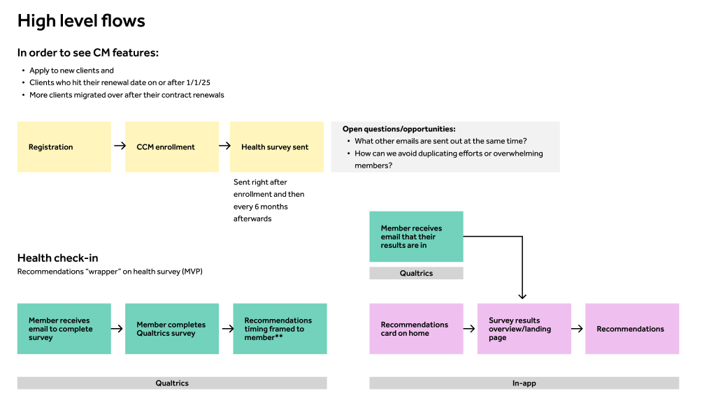
To understand the end to end experience, I created user flows depicting how a user would get their cardiometabolic health recommendations and worked with product and engineering to communicate and expand on those requirements. We identified the other teams we'd need to involve, such as marketing and the platform team, to create our email campaign and flow entry points. Push notifications were out of scope so were not included in the flow.
Exploration
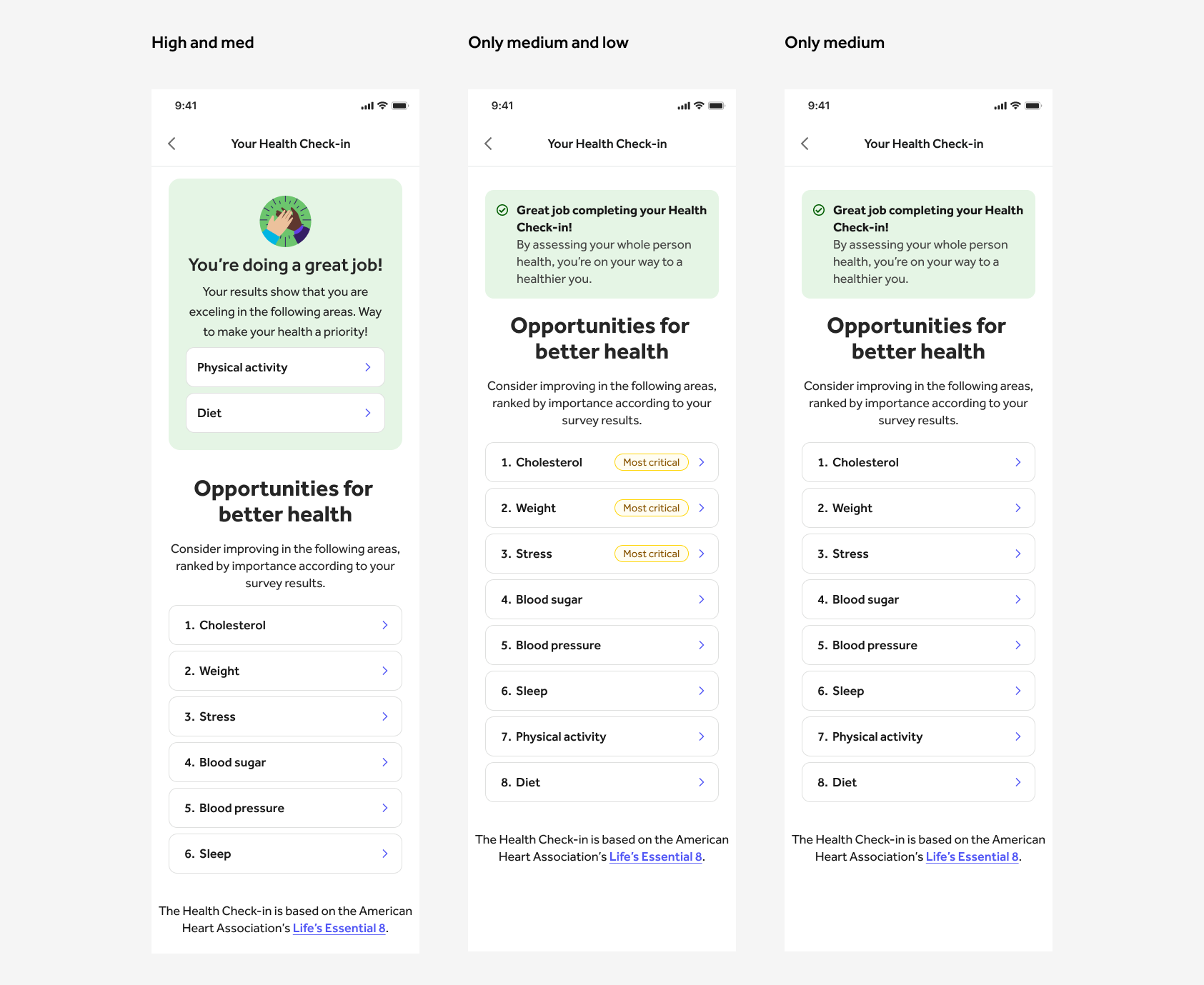
Creating a recommendations screen without a "score" was certainly a challenge. I was also constrained by our design system and needed to stay consistent with the rest of our app. I did many many iterations and played around with a lot of different ways of conveying a user's cardiometabolic health results to them. I also thought it was important to recognize when users were doing well in a particular area. I also considered whether we should create a guided experience, where users are walked through their most important areas of focus, or let the users decide where to go.

User testing
We used userinterviews.com to complete unmoderated testing on our questions, as well as test people's understanding of the concept of cardiometabolic health. I built two simple prototypes for this purpose. We didn't want it to be necessary for users to understand cardiometabolic health in advance to get value out of this feature. Our research results showed that people preferred having control over the interface instead of a guided flow. We also found that while people weren't necessarily familiar with the word "cardiometabolic", they understood the meaning behind the word based on the context given by the designs. They also weren't wanting for a "score" but they did want to see their data and get deeper insights. This was out of scope (given the data we have today) but helpful for the long term vision. I continued iterating the designs based on these findings.

Iterations & Refinement
I didn't think the recommendations screen was conveying our message clearly enough. I continued to iterate and landing on creating a special section of celebration for areas users were excelling in. The remaining health pillars would be listed in order of attention needed, with the most critical at the top. If users were doing especially poorly in one area, we labeled it as such to draw their attention even more. We went back and fourth on whether to label the "on track" pillars and ultimately decided to leave them unlabeled for simplicity.
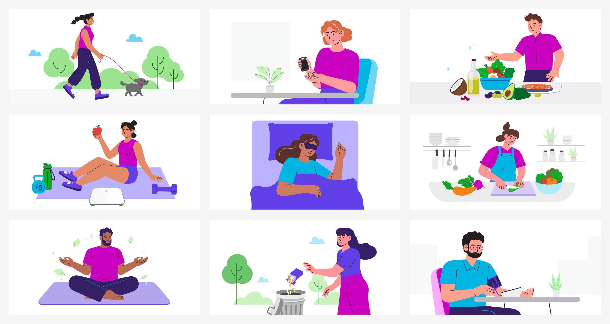
Custom illustrations in partnership with creative
I wanted to make sure that this feature was not only valuable but also beautiful. I worked with our creative team to have custom illustrations made for each of the health pillar pages. The illustrations really brought the pages to life and complimented the educational content and recommended next steps.
Final MVP designs

For MVP, the cardiometabolic recommendations will exist conceptually as a report, giving users direction on their health according to a snapshot in time. For the long term, building out our recommendations algorithm more robustly and giving users more insights in the moment will be a higher priority. For example, how might we make recommendations on cardiometabolic health if we can see where a user struggles day to day? How can we meet them in that moment and help them be successful? How might we connect the cardiometabolic health pillars in other places in the product? These questions will be explored in 2025.